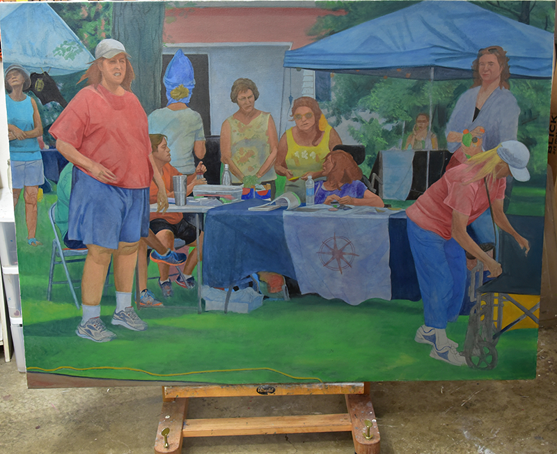
I worked on Booth at the Fair these past two days. It’s starting to move my way. I can struggle with paintings for a variety of reasons, sometimes technical, sometimes who knows what. This painting hit a groove straightaway and began to slide into place, except I didn’t want it to go that direction. Now, like I said, it’s beginning to go the direction that I want.

I took Prussian blue and phthalo blue out of my palette 3-4 years ago. I used to use Prussian blue a lot. Prussian blue and phthalo blue are very staining colors. In the photo of my palette, you can see that the rag has a blueish tint. You have to guard against these blues overpowering your other colors.

Yesterday, I added Prussian blue to my palette and today I added phthalo blue. I have several tubes left from when I used them both regularly. You can see four piles of phthalo blue in the middle of the palette; each is from a different vendor. One is from my ex-fav Old Holland.
Phthalo blue (PB17) is extremely popular today and has largely replaced Prussian blue (PB27). Prussian blue is darker and inky-er than phthalo, but phthalo is a better complement to flesh tones, burnt sienna-based tones, anyway.
Because of its popularity, manufacturers play around with the pigment (copper phthalocyanine) which results in a lot of variety in tone, although they are all dark and staining (at least of those I’ve tried).
After putting them both back in my palette, I intend to settle on one permanently. If I had to guess which one will be the eventual winner, it would be phthalo. But we’ll see.
Leave a Reply