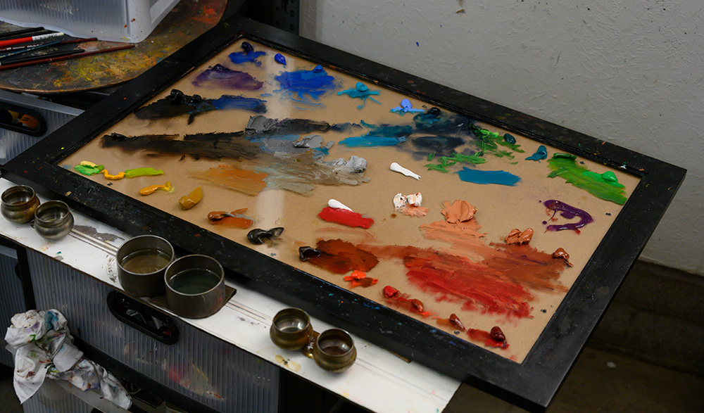
The problem with blended commercial oil paint
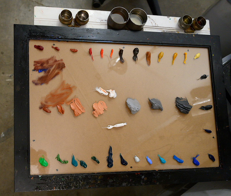
The ideal palette consists entirely of single-pigment colors. Such an ideal palette provides artists with total control over values and tones. This is especially important for artists, like me, who use lead white.
These days, even high-end brands use titanium white in their multi-pigment colors. Old Holland, for example, uses a blend of titanium white, zinc white, and ultramarine blue in its King’s Blue.
If I use this King’s Blue with one of my lead-containing tones, the horrid titanium white overpowers the other colors. Worse, such a malformed color appears garish next to the other well-behaved values in the painting. Of course, I can control these unruly colors but why not just mix the thing myself?
The trend among paint manufacturers is toward ever more ‘designer’ colors. Artists must be alert and not assume their paints are single pigment. To pick on Old Holland again, their Naples yellow deep extra is made with a single pigment, PBr24-chrome antimony titanate. Well and good. However, Old Holland offers two other ‘Naples yellows.’ Naples yellow extra is made with a blend of three other pigments–titanium white, zinc white, and mars orange (what happened to the chrome antimony titanate?). To cap off this example, their Naples yellow reddish extra has yet again a different assortment of pigments: diarylide orange, titanium white, nickel titanium yellow, and zinc white.
Old Holland is notorious for offering multiple versions of similarly-named paints, and, as we see here, often with entirely different pigments. If a leading brand like Old Holland is doing this marketing sleight of hand, you can bet the other brands are doing it too.
In the real world, as opposed to the ideal, there aren’t pigments that fit some points on the color wheel (at excellent saturation/intensity). The most obvious example of this problem is chartreuse (yellow-green). There is no pigment available that provides a high-saturation chartreuse that has artist-grade lightfastness.
The closest thing that was available is PY 157 (Nickel Barium Titanium Primrose Priderite). That pigment isn’t made anymore and it was quite pale (not so saturated), so not really a satisfactory pigment for that spot on the wheel anyway. It was an excellent pigment (once available, for instance, in Holbein’s Nickel Yellow which was actually a green that was strongly yellow-leaning) but that’s beside the point.
Perhaps we might see some of the new Yttrium-based mixed metal pigments give us a good chartreuse. However, so far, the person who has made those (and sells them on Etsy) hasn’t been able to produce useful saturation. What he has made isn’t competitive with a mixture of cadmium lemon and viridian.
There simply is no choice but to offer a mixture when selling a chartruse/green-yellow paint tube. It’s impossible to get the level of chroma/saturation/intensity from a single pigment, with current pigment knowledge.
Imitating pigments that have problems. Real Naples yellows use lead antimoniate, which is a toxicity issue (some countries entirely ban lead pigments, even for professional artists) and which is expensive to procure for artist materials companies. Iron oxides, titanium white, and cadmium yellow/orange are extremely cheap by contrast.
Lead pigments also can darken from exposure to sulfur dioxide air pollution (possibly less of an issue if the painting is varnished).
I have also seen genuine Naples and Lead-Tin (a very similar pigment, chemically) from Robert Doak react with metal palette knives. So, for palette knife painters (and brush painters who work a bit with knives in their paintings) that is a problem. Finding high-quality painting knives that aren’t made with a reactive metal isn’t easy.
Another problem is that no supplier offers the reddish form of genuine Naples yellow anymore. I had several tubes of Kusakabe from the 1940s and that shade was much more pink than what Harding, Rublev, and such offer. That was a wonderful paint but unfortunately the quick-drying nature of it meant that the paint was already semi-dry when I tried to use it — and that was with lead tubes which typically offer better longevity.
Even more dramatic, in terms of problem pigments, are fugitive pigments. Those definitely must be replaced with something else. Almost always, that requires a mixture.
Multi-pigment mixtures are a fact of life, whether one buys tubes with them premade or one does it on the palette. The key is for them to only be offered when they’re necessary. When a chemically stable lightfast pigment with equal or better saturation and the other desired qualities (such as low toxicity) is available, multi-pigment mixtures are typically superfluous. In watercolor, though, special effects can also make them useful, like pigment separation. Another thing they’re used for is to simulate extinct pigments. Artists who have grown to rely upon the way those pigments perform might find a convincing simulation better than having to re-learn their technique more to compensate for the total loss of the shade.
Also, the issue of the titanium white overpowering your mixture would be avoided if the imitation Naples would use lead white or lithopone instead. So, that’s not really a problem inherent in multi-pigment mixtures. It’s a problem with that particular formulation. And, an artist who wants a powerful mixer would prefer having titanium white in the mix.
My biggest complaint about imitation Naples paints is that none of them that I have seen have the same level of chroma and opacity as the genuine lead pigments. However, I haven’t checked all of them. What I’ve seen are bland paints. Winsor & Newton’s, for instance, are very bland. These imitations are also not as lean and dense, so they don’t behave similarly.