Oil Paint Brands Update 5/9/14
-
Read more: Oil Paint Brands Update 5/9/14
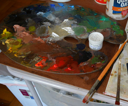
I added RGH to my oil paint brand reference. RGH has supplanted Winsor Newton as…
-
 Read more: In the studio 5/4/2014
Here is another painting from the cycle of large paintings ( this one is 42″…
-
 Read more: Review: RGH Oil Paint
RGH Oils is a small manufacturer that promotes its wide-range of lead-based whites. I think…
-
Read more: RGH oil paint
I placed my first order with RGH Paints. They are a small outfit that prides itself…
-
 Read more: In the studio 4/6/2014
Two Cakes is 48″ x 48″. Unfinished, of course, as are most of the paintings…
-
 Read more: Glop, goo, and jelly
I’ve never understood the fascination with thick, viscous oil painting mediums. Used for special effects, such…
-
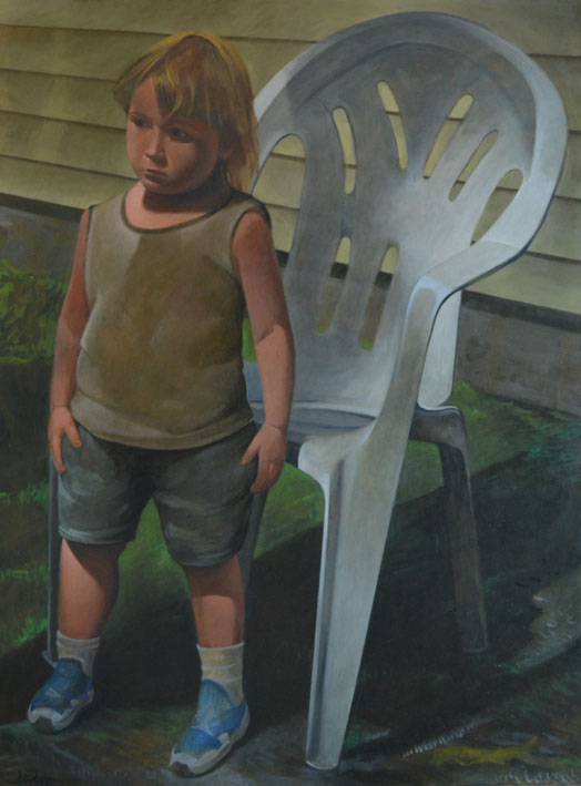 Read more: Painting: Keith in Front of a White Chair
I finished this painting three days ago. Keith in Front of a White Chair, is fairly…
-
Read more: Bad easel
I listened to songs by PJ Harvey during this morning’s painting session (actually drawing session).…